Customer Support : 020-61923200, [email protected] | Call and Trade : 020-61923220

Ratio Chart
#relative-strength #ratio #comparison #pairs
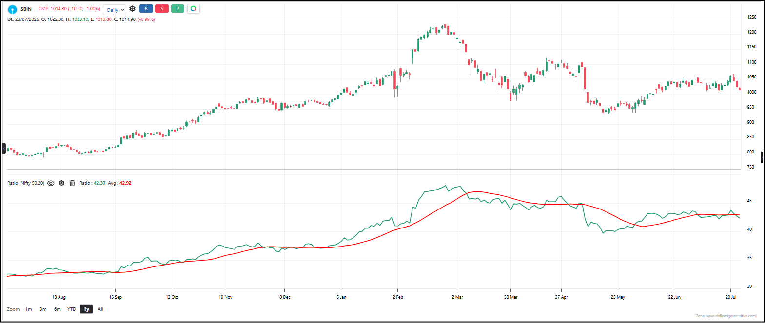
Ratio Chart compares two assets by dividing one’s price by the other’s. The result is a single line that shows relative strength. When the line rises, the numerator asset is outperforming the denominator. When it falls, the numerator is underperforming. It’s the go-to tool for comparing a stock against an index, one sector against another, or any two assets you want to measure head-to-head.
Default period: None (runs continuously)
Line behavior: A single line that moves up when the numerator asset is stronger than the denominator, and down when it’s weaker. Trending up means sustained outperformance. Trending down means sustained underperformance. Flat means both assets are moving together at the same pace.
Useful readings:
– Line rising — the numerator is outperforming the denominator. Relative strength is improving.
– Line falling — the numerator is underperforming the denominator. Relative strength is weakening.
– New highs — the numerator has never been stronger relative to the denominator.
– New lows — the numerator has never been weaker relative to the denominator.
– Flat and stable — both assets are moving in lockstep. No relative edge.
– Sharp reversal after a long trend — the relative leadership is changing hands. A rotation may be underway.
Objective rules:
– Go long the numerator (and short the denominator) when the ratio breaks above a key resistance or moving average.
– Go short the numerator (and long the denominator) when the ratio breaks below a key support or moving average.
– Exit when the ratio reverses back through the same level.
– Use the ratio to pick the stronger asset in a pair — trade the one on top.
– When the ratio is at extreme highs or lows after a long trend, expect a mean reversion — the relationship can’t stay stretched forever.
– Combine with your own moving averages or trend lines on the ratio chart for entry and exit signals.
What makes it unique: Price charts tell you where an asset is going. Ratio charts tell you who’s winning. In a rising market, not all stocks rise equally. In a falling market, not all stocks fall equally. The ratio chart strips away market noise and shows you the pure competitive relationship between two assets — making it the foundation of pairs trading and sector rotation strategies.
The indicator table value in TradePoint & RZone also provides you with a list of all values of this indicator for any group of stocks. This will allow you to compare the readings of this indicator across different stocks.
The indicator is applicable to all types of charting. Calculated based on the number of columns on P&F charts, bricks on Renko charts, lines on Line-break charts, candles on Heikin ashi charts, and lines on Kagi charts. While the formula and reading of the indicators remain the same, they become more dynamic on these charts.
This indicator is also available in the System Builder of RZone & TradePoint for all charting methods. Using the system builder, you can develop various strategies based on the different conditions already present in this indicator. Additionally, it can be used with other indicators or price patterns to develop effective trading strategies. For any group of stocks and market segments, you can scan and backtest stocks based on those strategies.