Published on: December 4, 2025
A trader’s best edge is not being able to predict the future, but being ready for it. When insights come in a structured, intuitive, and data-rich way, getting ready is easy.
One of the tool is the Nifty Analysis Scanner in the Definedge Zone Mobile App.
To make learning easier, let us look at all of its parts from the bottom up, starting with setups and going to Relative Strength.
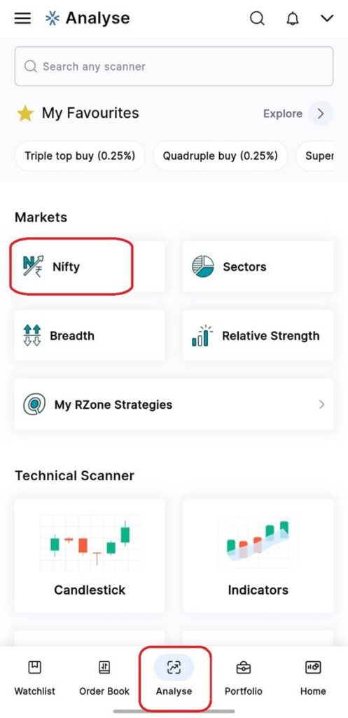
This analysis shows how a trader builds confidence, starting with specific setups and moving on to how the market as a whole behaves.
- Gauge Meter: A Quick Look at the Market Mood
The Setup section is the base of your Nifty Analysis. The meter says:
• Nifty Setup Score: 16%
• Trend: Neutral
• Level of Breakout: 25,332
• D-Score: 68% What it means: Bullish and High Momentum
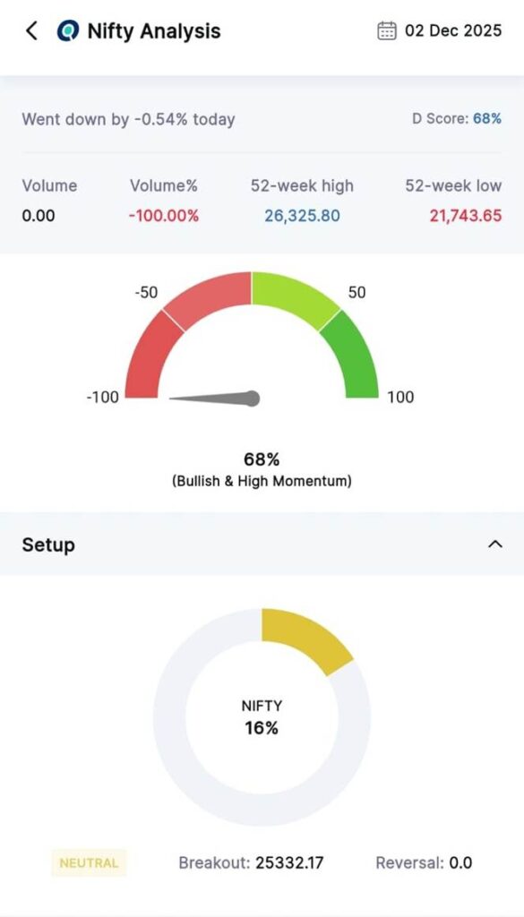
This tells traders that the overall structure may be helpful, but there aren’t many high-probability trading setups available.
Traders can make directional plans at breakout levels, whether they are breakout traders, options strategists, or swing players. The meter also gives you a quick, easy-to-understand picture. A trader can tell if the Nifty’s engine is revving up or cooling down even if they know little about technology.
2. Breadth: What the Market Is Breathing
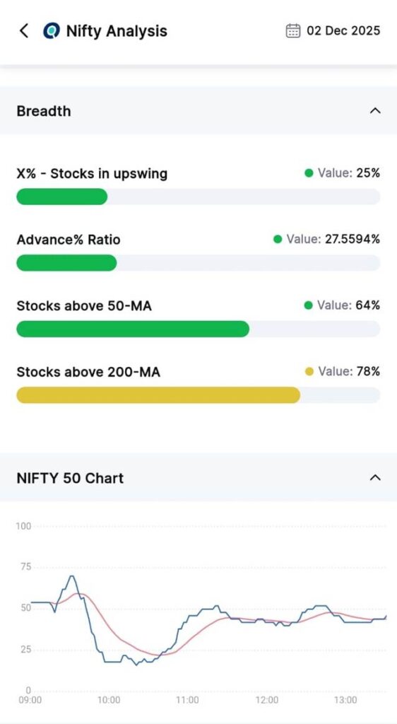
The breadth section shows how the market thinks. It shows that 25% of stocks are going up.
• 27% of the advance ratio
• 64% of stocks are above the 50-MA
• 78% of stocks are above the 200-MA.
- IV Chart Return Snapshot: The Microscope of Time
This part looks at the volatility and Nifty performance over a number of time frames:
• Daily: –0.54%
• Every week: –0.64%
• Every month: –0.64%
• Every three months: 5.79%
• Every year: 10.11%
The short-term drops against strong long-term returns are a classic example of micro pullbacks inside macro uptrends.
In markets, volatility is the language of feelings. The IV chart shows:
- Implied volatility
- Historical volatility (10D & 30D)
- IV Percentile (IVP)
- IV-RV Spread
This part is great for people who trade options.
- When IV goes up faster than HV, the market thinks there will be bigger moves.
- When the IV percentile is low, premiums might be lower than usual.
It shows how nervous, excited, and hopeful the market is all at once.
4. The Chart Setup – Deep Dive into Technical Chart Pattern
This part puts together a diagnostic summary of several indicators:
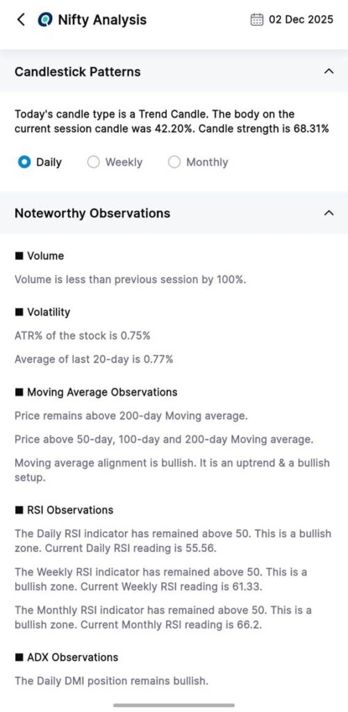
Volume – The volume dropped by 100% from the last session, which means that fewer people took part.
Volatility (ATR)
• ATR%: 0.75%
• ATR% for 20 days: 0.77%
Stable volatility, no sudden growth.
Averages that move:
- 50-day moving average
- 100-day moving average
- 200-day moving average
The alignment shows a clear upward trend.
- RSI
- Daily RSI: 55.56
- Weekly RSI: 61.33
- Monthly RSI: 66.20
- All of the above 50—momentum is bullish on all time frames.
ADX Daily DMI stays bullish, which strengthens the trend.
This part is like looking at a medical report to check blood pressure, heart rate, and oxygen saturation, but it’s for the Nifty.
- Candlestick Patterns: Telling a Story With Today’s Candle
Candlestick patterns show the mood of the trading session. - Type of Candle: Trend Candle
- Body of Candle: 42.20%
- Candle Strength: 68.31%
A strong trend candle shows that the price is moving in a clear direction, which is useful for planning for the day and the short term.
- Patterns in Point and Figure: Structure Comes First
P&F charts show only the price structure.
• 7.69% of the counter-trend ratio
• Pattern: Consolidation
• Price in the X column of the 0.25% box chart
The low counter-trend ratio shows that the trend is stable, while consolidation suggests a break. At this time, the presence of X-columns shows upward pressure.
This is very helpful for pattern-based traders who depend on breakouts like triple tops or bullish catapults.
6. Renko Patterns: Trends That Don’t Last
Renko charts make it easier to see how prices change by taking out time and only showing bricks.
The readings show that 0.25% of the bricks are bullish and 1% are bearish.
- Above MAST clouds
- Supertrend bullish
- Brick Zone bullish
- Above Bullish D Smart Bands
This is a full set of bullish confirmations that are perfect for trend traders.
- Line-Break Observations: Setups with a Narrow Range
Daily Line-Break observations show NR4 and NR7 patterns, which are narrow range days. These things often happen before volatility rises. People who love breakout trades pay close attention to these kinds of setups.
- Seasonality: When History Repeats (or Doesn’t)
The December seasonality numbers show:
• Average Return: 3.13%
• 70% of the time, it works.
This means that traders have made money in December 7 out of 10 years.
Seasonality doesn’t always mean movement, but it does give you a statistical guide, which is helpful when markets get noisy.
- RS Commentary: The Market’s Behavioural Pulse
The behavioural summary at the very top says, “Nifty 50 went down and underperformed—Drowning (Bearish).”
This gives a quick look at how someone feels and how well they’re doing.
The “Drowning” tag makes sense because it suggests weakness, stress, and not doing as well as others.
Analysis that goes up, clarity that goes up
Traders can move from data to interpretation to action in a structured way by looking at features like setups (actionable output) and RS Commentary (behavioural overview).
The Nifty Analysis tool on the Definedge Zone Mobile App is more than just a dashboard; it’s a market coach.