Published on: December 30, 2025
Numbers tell a story in the stock market, but only when they are seen together. It’s hard to get a full picture by looking only at one stock or one time frame. This is when The Performance Table becomes a useful and easy-to-use tool. It gives a clear picture of how a group of stocks, sectors, or indices has done over a number of time periods, which helps traders and investors make smart choices without getting confused.
The Performance Table is meant to be clear at its core. It shows returns for each stock in a chosen group over periods of time ranging from one day to ten years. Everything is shown in one place, so you don’t have to switch between charts or do the maths yourself. This is especially helpful for people who work in the Indian market, where sector rotation happens a lot.
Why the Performance Table is Important
Markets go through cycles. Even if a stock looks weak on a daily chart, it could still be a good long-term investment. On the other hand, a stock that is doing well in the short term might not do as well over the long term. You can see both sides at once with the Performance Table.
You can also change the time frame. You can easily pick the start and end dates if you want to look at performance between two specific dates, like from a Budget announcement to the end of the month. This makes the table very adaptable, no matter if you are a long-term investor or a short-term trader.
The “Save as Chart” option is another helpful feature. Numbers are helpful, but pictures help you see patterns more clearly. You can quickly see who is in charge, who is behind, and how strong a group is by turning the table output into a chart.
How sectors did in the December Series
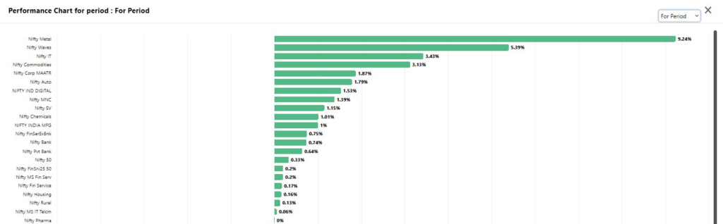
Now let’s look at how this tool can help us understand how different sectors are doing, especially in the December F&O series, which is a time when people often book profits, move their portfolios around, and get ready for the new year.
Bullish Sectors
Bearish Sectors
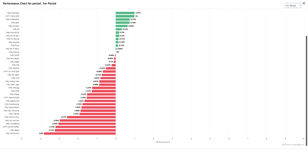
You can quickly see which sectors stayed strong and which ones cooled off by choosing sectoral groups in the Performance Table. Some sectors may have strong monthly or quarterly returns, which means they are gaining new momentum. Others may look flat in the short term but still have good performance over the long term, which means they are structurally strong.
When looking at stocks one by one, it’s hard to make this kind of comparison. But when you put the whole sector in a table next to each other, you can see clear patterns. Questions like “Is this sector just correcting, or has it been underperforming for a while?” are easier to answer when you have this information.
• Are a lot of stocks in the same sector moving in the same direction?
• As the year comes to a close, which sectors are getting stronger?
From Information to Study
The Performance Table isn’t just for looking at data; it’s for organising research. You can put stocks into a group based on certain conditions and then look at them more closely. You could, for instance, make a list of stocks that have done well in both the short and long term and keep a close eye on them for future chances.
How to Get to the Performance Table
To see how well something is doing over a certain time:
• Click on RZone > Table > Performance Table • Choose the Group and Period • Click on Scan • See the results in a Table or Chart form

RZone has this feature, which makes it easy for users to go from raw data to useful insights.
The Performance Table is easy to use and works well in a market where there is a lot of information. It doesn’t tell you what will happen in the future, but it does help you understand the past and present. This table is like a dashboard for the market, whether you’re keeping an eye on sector rotation, comparing stocks, or looking at how the December series did.
You don’t always need more indicators to make better decisions; sometimes you just need a better look at the data you already have.