Published on: January 30, 2026

The Nifty dropped 645 points, nearly 2.5%, last week. What do you think? Is this it or is this just the start of something larger?
If you are a trader, you have probably asked yourself the same uncomfortable question many times over the last few days.
When markets fall like this, uncertainty spreads faster than price. Screens turn red, opinions turn loud, and emotions quietly begin to influence decisions. In moments like these, the market doesn’t just test capital; it tests discipline, “your” discipline.
That is exactly when a trader needs something more reliable than opinions, forecasts, or headlines.
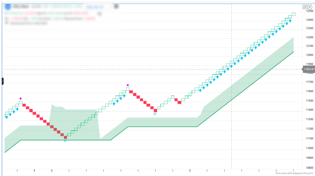
This week, instead of reacting to the noise, we turned to a disciplined, data-driven framework, the D-Smart Line, a Renko-based objective indicator designed to show what price is actually doing beneath the drama.
The Real Opponent Is Not the Market – It’s the Noise.
Sharp market moves create an illusion of urgency. Every pullback starts to feel like a breakdown. Every bounce looks like a trap. This is where emotional trading creeps in.
Time-based charts add to confusion. Even when the price goes nowhere, a candle gets printed in a time-based chart. Trends begin to look weaker simply because time has passed, not because the price has truly corrected.
This is precisely where Renko charts can help think differently.
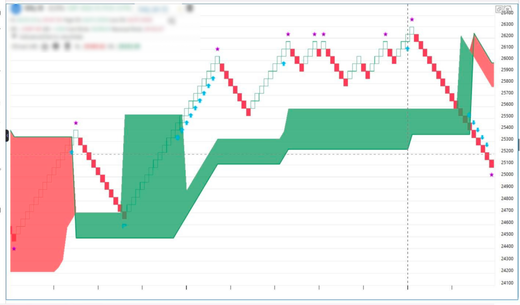
Why Renko (and D-Smart) Help observe What Candles Often Miss
Renko charts don’t move with time. They move only when price moves.
That means consolidation or noise doesn’t get captured in the chart. On Renko, only a real price pullback can create a reversal. This removes a huge layer of visual noise and makes trend strength, or exhaustion, far clearer.
The Disparity Index reinforces this idea. On time-based charts, a long sideways phase can reduce the stretch or in other words address the overbought or oversold condition, without any meaningful correction. In Renko charts, the stretch can be addressed only when price genuinely retraces.
The D-Smart Line builds on this foundation.
It adapts to market behavior:
- Stays aggressive when trends are strong
- Slows down when markets lose momentum
On the chart, this shows up as a clean structure: stars, arrows, and “P” signals, visual cues that help traders judge trend quality and possible transition points without interpretation overload.
What the D-Smart Data Is Saying Right Now
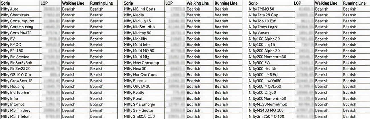
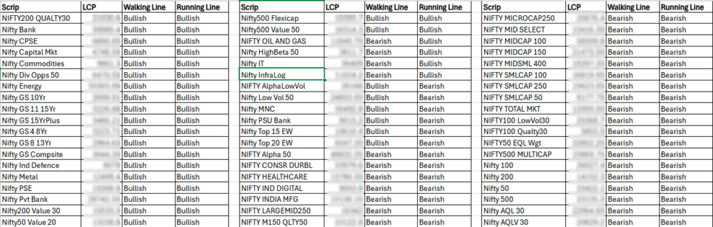
To understand the broader picture, we analyzed the D-Smart Matrix across major Nifty sectoral indices using two lenses:
- Walking Line: short-term trend pulse
- Running Line: broader, positional trend
Here’s what stood out.
The Leaders (Strength on Both Lines)
Only two sectors are bullish on both the Walking and Running Lines:
- Nifty Metal
- Nifty PSU Bank
This tells us that trend strength here is intact across short and medium timeframes. These are currently the only areas where trend-following strategies still make structural sense with disciplined stops and controlled positional sizing.
The Warning Zone (Mixed Signals)
Two sectors are showing a split personality:
- Nifty IT
- Nifty CPSE
Their Walking Lines remain bullish, but their Running Lines have turned bearish.
This usually signals pullbacks within weakening broader trends. For swing traders, this is a zone of opportunity but also a zone of danger. These are “trade the move, not the story” setups. Attachment here can be costly.
The Risk-Off Majority
The bigger message comes from what most sectors are doing.
Banking, Auto, Pharma, Realty, Consumption, Manufacturing, Digital, FMCG, Financial Services, and Infrastructure; the majority of sectoral indices are bearish on both lines.
This is classic risk-off behavior.
Participation narrows. Leadership thins out. Defensive positioning quietly increases.
When markets behave like this, survival becomes more important than aggression.
How Different Market Participants Should Read This
Trend Traders: Stay close to strength. With Metals and PSU Banks still holding structure, they remain the only trend-aligned opportunities. Even here, risk management isn’t optional; it’s the strategy.
Swing Traders: Be selective and fast. Mixed signals can offer short-term trades, but the bearish Running Line is a clear warning against overconfidence. Trade price movement, not conviction.
Investors and Positional Traders: Patience matters. When most sectors are bearish basis the Walking Line, deploying fresh capital aggressively often leads to frustration. Historically, when D-Smart turns together across multiple sectors, it signals a more stable phase worth committing to.
Trend vs Headlines
Bad news doesn’t push markets down.
Weak trends do.
Right now, the D-Smart Line is quietly highlighting a loss of breadth. When only a handful of sectors hold bullish structure, index-level weakness becomes more vulnerable.
For long-only traders, this isn’t the phase to showcase bravery. It’s the phase to protect capital.
Preservation today is what gives you the confidence and the capital to act decisively when trends realign, and D-Smart Lines begin to turn together again.
Final Thought: Is This It?
Whether this fall deepens or stabilizes is something the unfolding price action will decide, not opinions.
What matters more is how you respond.
In markets controlled by bears, discipline is the edge. Disciplined systems matter more than stories. And frameworks that cut through noise matter more than predictions.
When the bricks turn red and the D-Smart line is violated across multiple sectors, the goal is not to guess the bottom.
It is to stay structured, stay solvent, and be ready for when the data finally says it’s time to move again.
Where can you analyze all of this easily?
You don’t have to calculate or track these ratios manually.
You can access the D-Smart Line indicator on Renko charts in Zone Web by Definedge
To stay connected and updated with more such educational, data-driven content:
Consistent learning is the most underrated edge in long-term wealth building.